Fourth In A Series: An Ounce Of Prevention — Video
August 20, 2013
Experience & Results: Most-Followed Trials
September 6, 2013Previously: Part 1 | Part 2 | Part 3 | Part 4
 With the Consumer Attorney’s Association of Los Angeles’ (CAALA) annual Las Vegas Convention arriving August 29, we’re serializing a feature article on trial presentation that appeared in the May 2013 issue of CAALA’s Advocate Magazine. Earlier this week, Rick looked at the power of video as a presentation tool and how it is much more than just lights, camera, and action. In the final installment of the series, he wraps things up by giving you the big picture on graphics:
Graphics are meant to supplement your arguments, not replace them. Or to put it another way, your exhibits should support your positions, not serve as advocates in
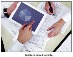
and of themselves. Graphics are used to dissect complex material into palatable bits of visual information for the jurors. When graphics of any kind are prepared properly using the right emphasis, flow, and color psychology, they will achieve these objectives. Here are ways to create graphics that simplify, rather than convolute your arguments.
• Use visual aids
We have become a visual society. Jurors, like the rest of us, process the information they receive primarily through sight. People retain only 30% of what they hear, and only 5% of what they touch, but they retain 65% of what they see.To be effective, a graphics presentation should provide a clear message of who and what was involved, where and when the events happened, and how the injury or series of events could have been prevented. All of this leads us to the why. Why should substantial damages be awarded?
• Create a theme
A recurring theme which is repeated throughout your presentation should extend to all of your visuals. This keeps the theme at the forefront of the jurors’ minds, and ensures that it doesn’t get lost amidst other evidence presented later.
• Be clear and consistent
Maintaining a uniform visual standard creates consistency. Use the same fonts, colors, and corporate logos across multiple exhibits to foster unity and familiarity with your audience. To achieve maximum clarity and juror readability, it’s best to use a white background for an exhibit board, and a black background for a screen presentation. Finally, be mindful to keep the size of text at least 14 point to ensure readability.
• Less is more
Visual aids should make your case easier to understand, not harder. Stick with the basics such as flow charts, diagrams and graphs to supplement what you are explaining. To boost juror retention, limit your content to statements and phrases rather than lengthy sentences and paragraphs. Use multiple slides and bullet points judiciously to identify and break down case material into manageable sections.• Mix it up
In addition to using traditional boards and graphics, add dimension to your presentation through the use of other multimedia graphics such as animation or interactive charts. With new iPad technology you can present in Slideshark or Keynote wirelessly, and experts can markup medical illustrations, medical films, and other exhibits directly from the witness stand. Mixing it up keeps jurors alert and engaged.
• Inoculate against bad facts
Your graphics should emphasize the facts that support your case. However, if there are bad facts against your client, include them in your graphics, don’t hide from them. For example, add a pre-injury diagnosis to your timeline. This enhances your credibility, and allows you to address the issue before it arises from opposing counsel.• In Summary
The quality of your trial presentation should match the quality of the argument you’re making. If you excel at telling your audience what happened, but your efforts at showing what happened don’t demonstrate that same level of professionalism, your case will appear uneven. The success or failure of any trial presentation depends on the skill with which it is crafted and presented.
Even if you follow all of the preceding tips, there is still the chance that things can go wrong. When they do, you’ll have to determine on your own how to best correct them. That’s why it’s often to your clients’ benefit for you to hire professionals whose sole responsibility it is to make sure that your visual aids are on par with your oral skills.
I’ve been known to climb into race cars, but I admit, like using technology, knowing your limits is essential. If there is any doubt about whether you should be creating your own exhibit database, video documentary, or graphic presentation, and then setting up your own equipment and presenting it in court, turn to those who are experts in this field. After all, that’s why your client hired you, because when they have a lot at stake, they know that they aren’t qualified to be acting as their own counsel. Trust the experts in the field who have the experience. Preventing the problem in the first place is as valuable as knowing what to do once something goes wrong.


